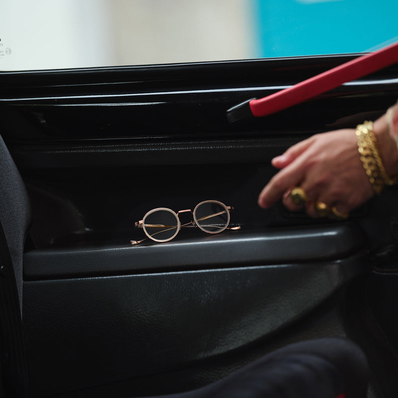

From sculpted acetate to fine Japanese titanium, a closer look at the shapes, materials and optical thinking behind the British eyewear house.
Two Opticians, Two Complementary Instincts
Founded in 1969 by opticians Graham Cutler and Tony Gross, the brand opened its first shop at 16 Knightsbridge Green, London, in 1971. Their partnership brought together different sensibilities: Cutler’s meticulous attention to technical detail and Gross’s expressive approach to style.
That combination gives the collections a useful context. Visual confidence and optical discipline have been connected from the beginning. The early bespoke service also placed the individual at the centre of the process: eyewear was something to consider in relation to a person, rather than an isolated object.
Acetate gives Cutler and Gross room to work with volume, colour and depth. The brand’s Italian-made acetate eyewear is shaped, polished and finished by hand, with the material contributing as much to the result as the outline itself.
These differences matter when choosing glasses. Two frames with similar dimensions can create very different impressions depending on colour density and finish. Looking at a frame from the side, as well as straight on, helps reveal how its volume has been distributed.
Familiar Shapes, Reconsidered
The collections move between square, round, rectangular, aviator and cat-eye forms. These categories are a starting point; the specific treatment gives each frame its expression.
Consider the 1407 optical in Black on Crystal. Its raised, stepped browline meets a rounded lower section, while the layered construction places dark acetate against transparent edges. The contrast makes the silhouette read differently across its upper and lower halves.
Elsewhere, the 1439 optical explores a broad browline and generous rectangular proportions, softened by slightly rounded, lowered lenses. Its references reach towards American eyewear and the larger scales of the 1970s and 1980s. Here, the archive becomes material for a contemporary design rather than a fixed template.
For the wearer, these distinctions are more useful than a simple choice between “classic” and “bold”. A frame can be both familiar and assertive, depending on how its proportions are handled.
A Different Expression in Titanium
Titanium introduces another register. Cutler and Gross’s Japanese-made titanium eyewear comes from Sabae, with the brand first introducing this part of its offer in 2001. The material’s strength and low weight support fine structures and precise metalwork.
Where substantial acetate can give colour and volume a leading role, a fine metal frame directs attention towards line: the bridge, the rim and the connection to the temples.
The Knightsbridge 1971 sunglasses demonstrate how much character those elements can carry. Their navigator construction combines an elongated bridge, a defined brow bar and rim wire incorporating the Oyster pin motif. The visual identity is built through the metalwork itself.
Details Worth a Second Look
Pins, hinges and the transition between front and temple deserve closer attention. Across the range, their treatment changes with the design.
On the 1386, the documented construction includes seven-barrel hinges and Bullion frontal pins. The 1439 uses five-barrel hinges, Compass Star frontal pins and flush-set Oyster temple pins. These are model-specific choices, rather than specifications to apply to every Cutler and Gross frame.
This is where examining eyewear becomes rewarding. Small changes can alter the rhythm of a design, the emphasis at its corners or the way its surfaces meet.
Finding Your Own Balance
When exploring Cutler and Gross glasses and sunglasses, begin with the effect you want the frame to create. Consider an opaque finish for a more defined outline, transparency for a different relationship with light, or fine metalwork when line matters more than volume.
Then look beyond the first impression. Compare the bridge, the frame width and the position of the eyes within the lenses. Personal expression and appropriate fit deserve equal attention.
The Autumn Winter 2026 collection, The Joy in Design, returns to the complementary instincts of the founders: care for fit alongside a willingness to explore. It is a fitting perspective on the wider brand, where individuality emerges through considered decisions about everyday objects.