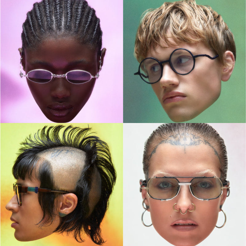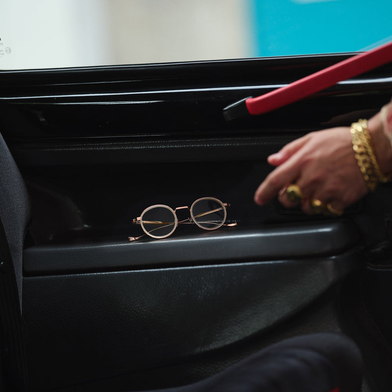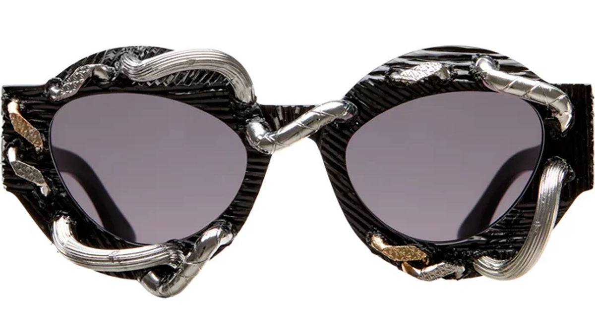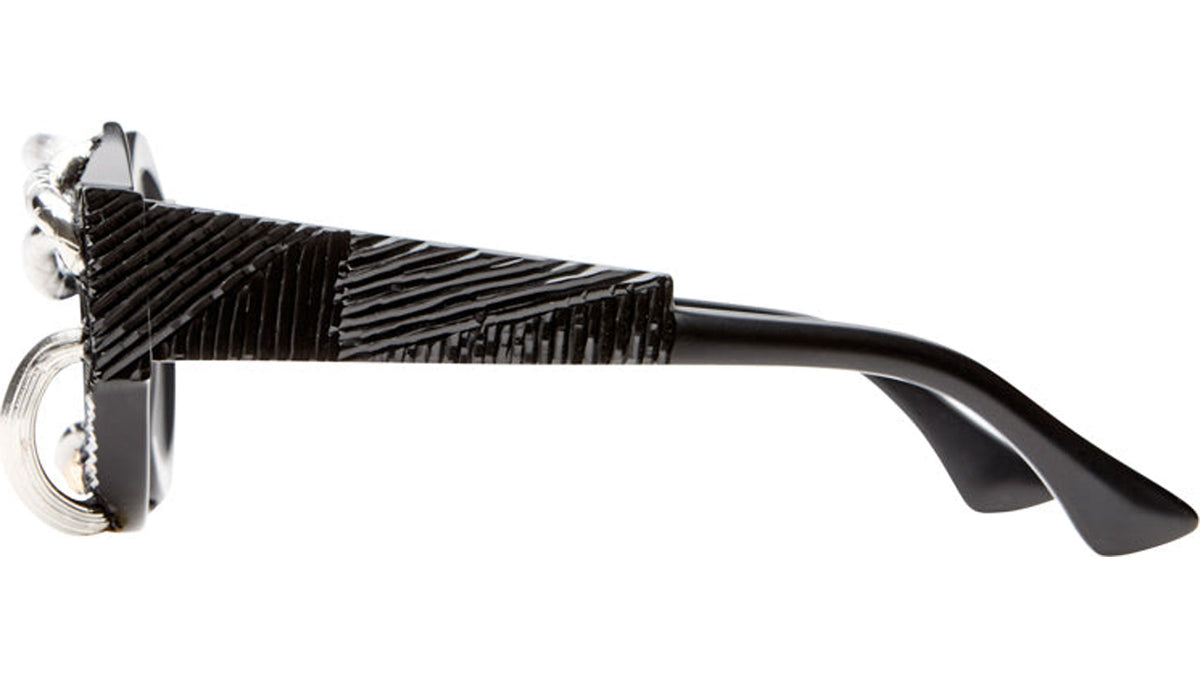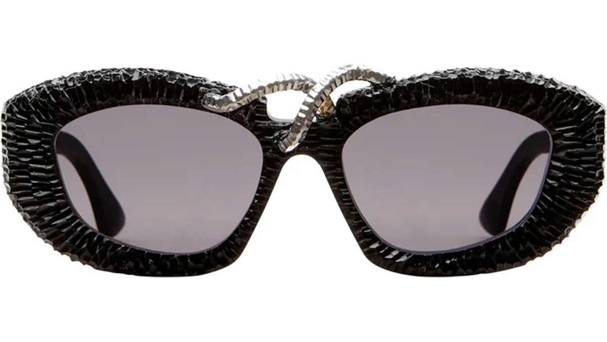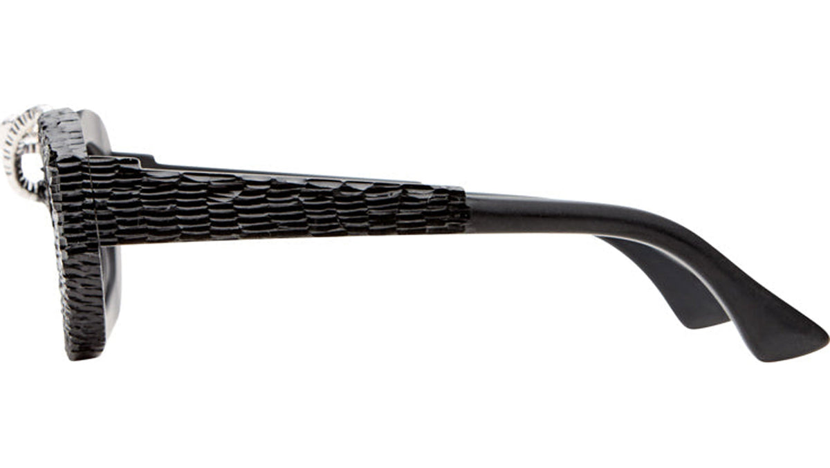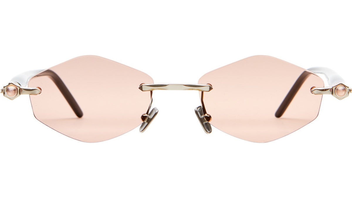

Exposed metal structures, angular rimless lenses and Havana acetate reveal different expressions of Kuboraum’s design language in the latest arrivals on eye-oo.
An outer metal structure extends beyond a circular lens. A bridge connects two sharply cut, rimless shapes. An oval acetate frame introduces the mottled colour of Havana. Across the latest Kuboraum arrivals on eye-oo, the relationship between structure and silhouette becomes a subject in its own right.
These designs approach the idea of the mask through different visual languages. Some resemble small mechanical assemblies, with separate components clearly visible around the lenses. Others concentrate their expression in a continuous acetate outline. Together, they reveal a vocabulary that moves between industrial references, sculptural form and colour.
The mask as a space for identity
Kuboraum describes its eyewear as masks designed to highlight the personality and character of the wearer. Within the brand’s philosophy, the mask also represents a space of shelter and intimacy: an enclosure from which to observe the world.
This architectural idea connects designs that can appear very different. A frame may establish its presence through an enclosing border, an open framework or the exposed edges of its lenses. Each creates a different relationship between the object, the face and the space around the eyes.
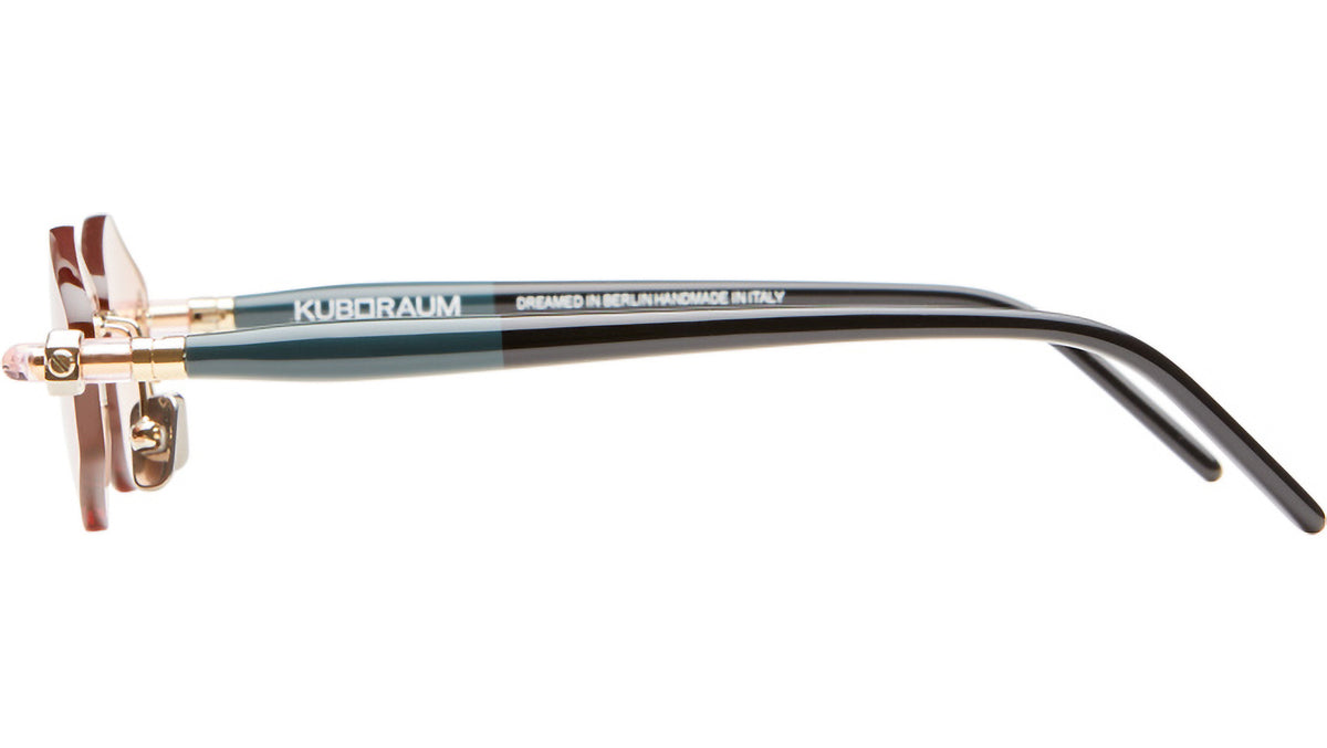
The brand places its creative work in Berlin and describes its masks as handmade in Italy. Its design identity emerges through the interaction between this conceptual framework and the physical details of individual pieces.
Machinery: a structure beyond the lens
The mechanical aspect of Kuboraum’s vocabulary is particularly visible in Z50 GM Gunmetal and Z52 RH Dark Gunmetal, both included in the brand’s Machinery collection.
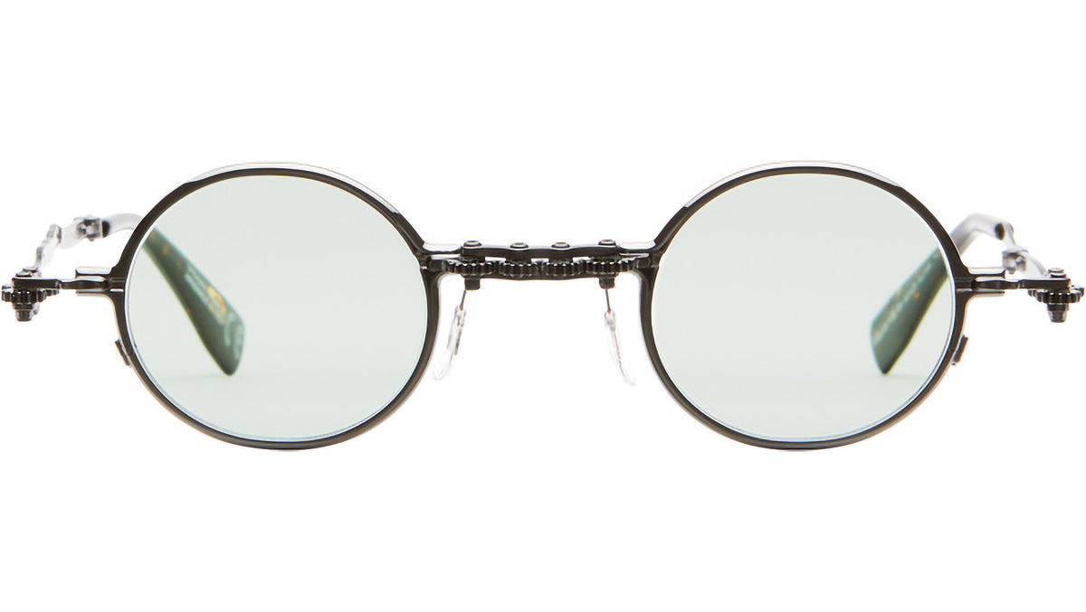
In Z50, circular lenses sit within a broader metal framework. The outline extends beyond the lens surrounds, leaving open spaces between the different elements. This separation gives the front a layered appearance: the lens shape and the overall silhouette remain distinct.
The GM version combines gunmetal and silver-coloured metal with light-green lenses. Kuboraum specifies metal construction with acetate temple tips. The contrasting finishes reinforce the visual separation between components, while the pale lens tint remains part of the composition.
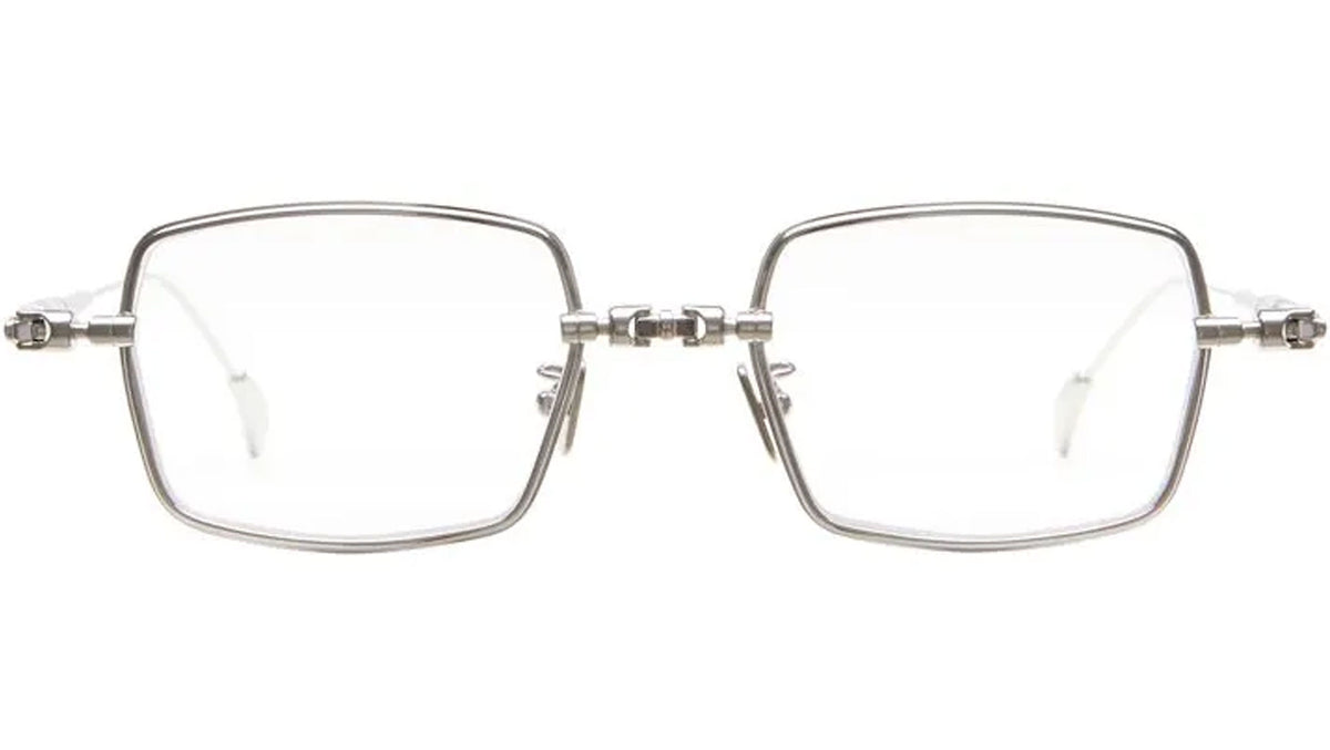
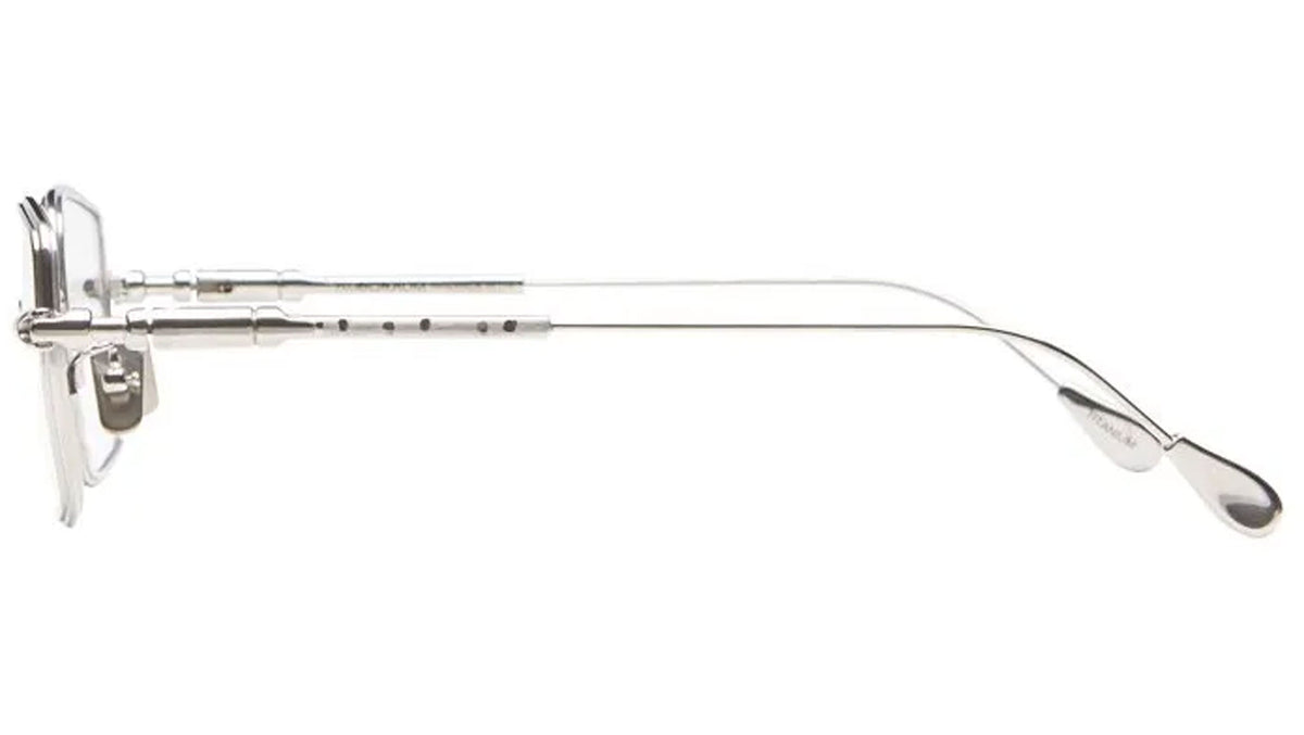
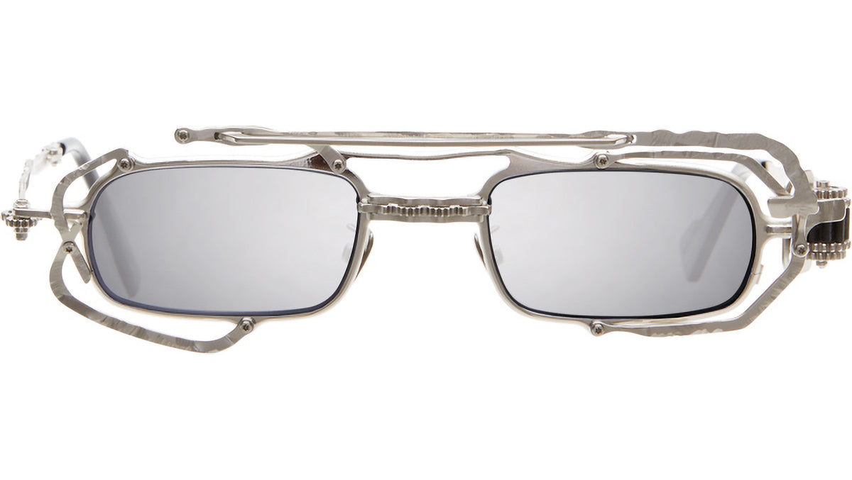
Z52 translates this mechanical vocabulary into a rectangular format. In the Dark Gunmetal version, the extended structure around the lenses and the upper connecting bar give the front a more horizontal organisation. Light-green lenses introduce a softer colour within the darker framework.
The two models demonstrate how a mechanical reference can produce different silhouettes. Circular and rectangular lenses become starting points for structures that develop beyond their immediate boundaries.
H81 and H83: curves within a mechanical vocabulary
H81 SI Silver and H83 LG Light Gold also belong to Kuboraum’s Machinery collection, bringing oval and round forms into this part of the brand’s work.
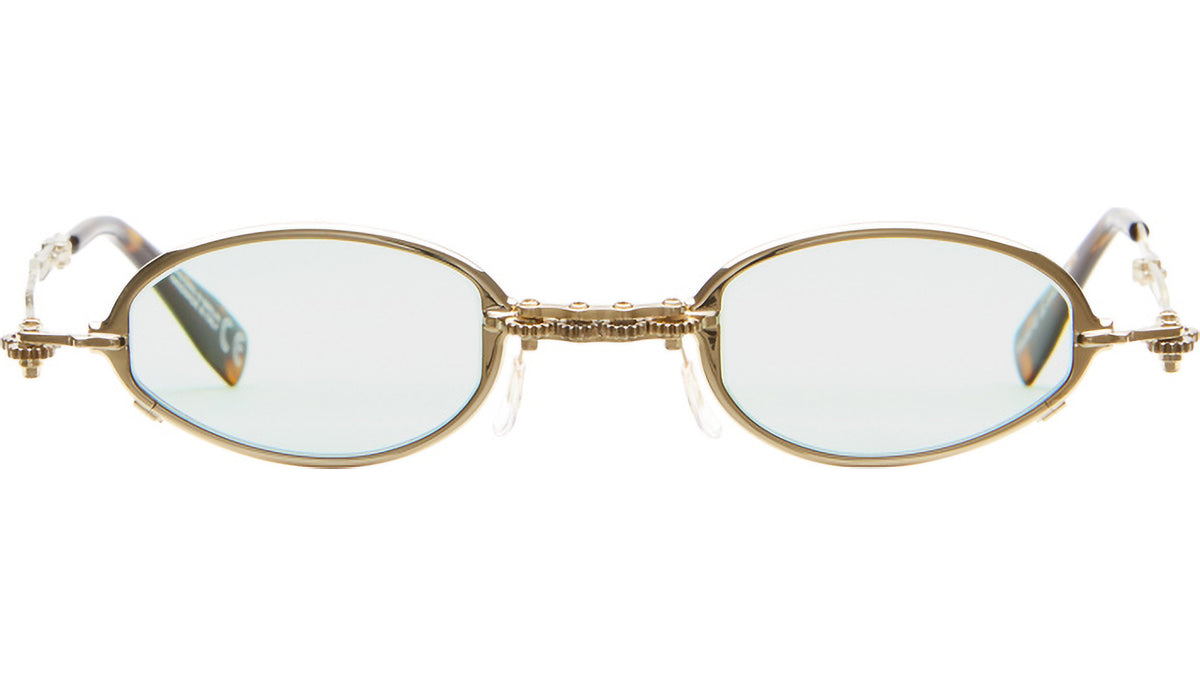
H81’s oval lenses establish a horizontal rhythm across the front. The silver-coloured metal structure follows and develops around that shape, with the bridge and lateral connections remaining visible elements of the design.
H83 uses round lenses within a light-gold metal frame, paired with a light-pink tint. The combination introduces a warmer palette, while retaining the emphasis on separate structural parts. Kuboraum specifies metal and acetate temple tips for both models.
Their inclusion in Machinery shows the range accommodated by the collection. Mechanical expression can emerge through curved forms and pale colours as well as darker, more angular constructions. The connections between parts provide continuity across these different treatments.
P60: the lens edge defines the silhouette
P60 SI TB Silver explores another relationship between structure and space. Kuboraum includes this reference in its Rimless collection, where the absence of a continuous surrounding rim allows the lens perimeter to define the shape directly.
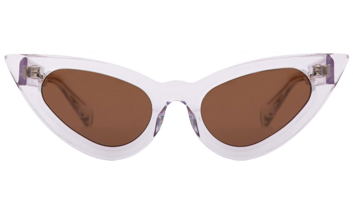
Its angular lenses create a faceted silhouette. The silver-coloured bridge and lateral attachments connect the two lens surfaces without enclosing them, leaving their cut edges exposed. Small coloured details at the outer attachments introduce concentrated accents within the otherwise open construction.
Here, the mask is expressed through the arrangement of separate surfaces and connecting points. The lenses carry much of the graphic identity, while the metal elements establish the intervals between them.
Acetate and metal: different treatments of the outline
P6 HAG Havana brings a continuous acetate surround into the selection. Its oval silhouette and Havana colouring create a different surface language from the exposed metal constructions. The pattern spreads across the front, making colour variation part of the frame itself.
The green-to-pink gradient lenses add another chromatic layer. Rather than separating the frame into visibly distinct mechanical components, P6 concentrates its expression in the relationship between the acetate border and the tinted surfaces it encloses.
Z71 SL Silver returns to metal through a rectangular silhouette, combining silver and matt-silver finishes with flash-grey lenses. Its double bridge adds a second horizontal line above the lenses, making the upper structure a defining feature.
Across these arrivals, Kuboraum’s mask takes shape through several approaches: an extended framework, a visible connection, a cut lens edge or a patterned acetate border. Their variety gives substance to the brand’s central idea, showing how a single design philosophy can accommodate markedly different objects.