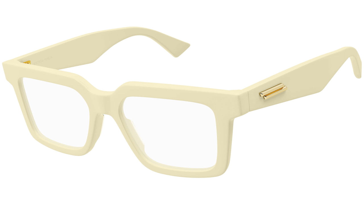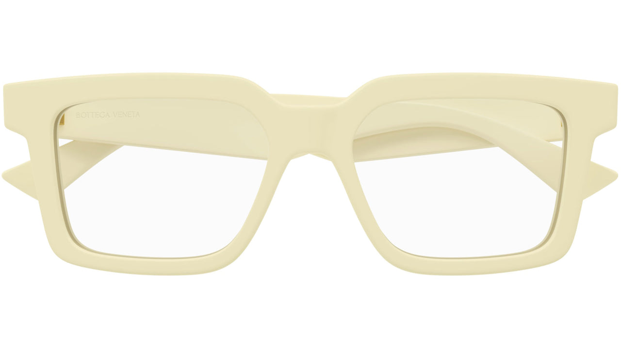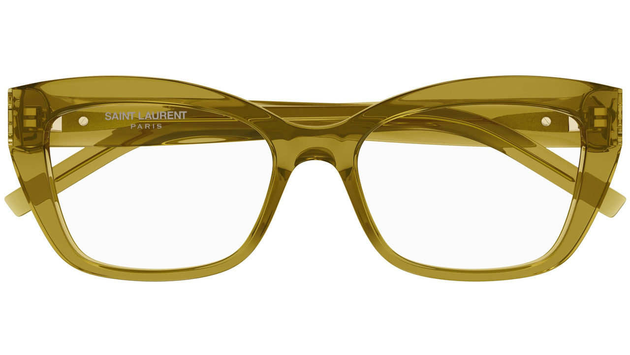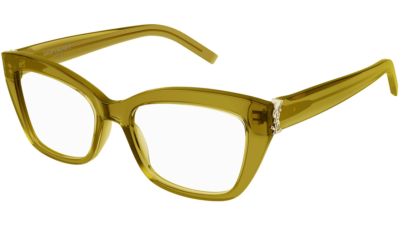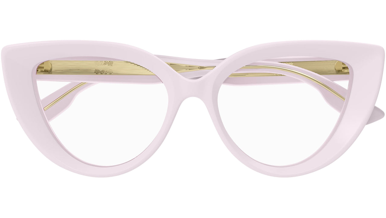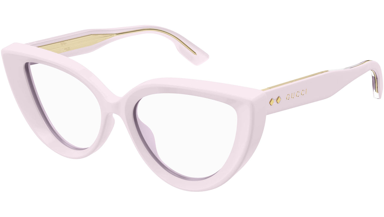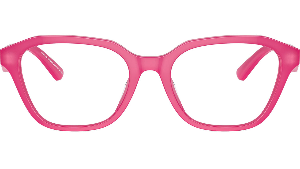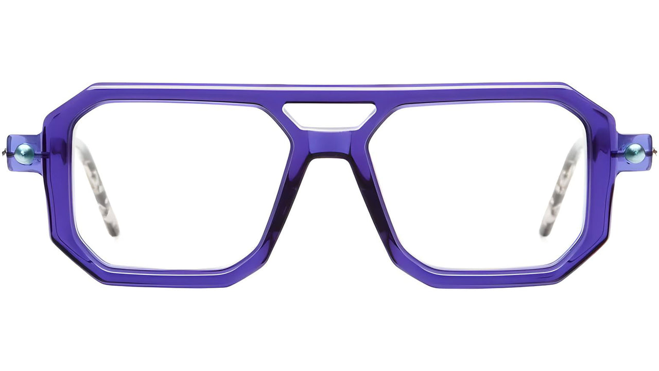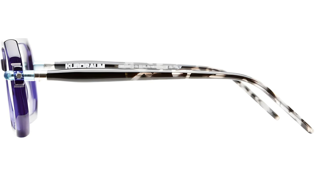

The colour of a frame is never just an aesthetic choice. It is one of the first things we notice when we look at a pair of glasses, and especially when we see them on a face. In eyewear, just a few centimetres of acetate or metal can change the perception of facial features and become a language of their own.
Colour as a form of identity
Colour psychology shows how different tones can influence perception and emotion. In eyewear, however, colour becomes even more personal: it lives on the face, frames the eyes and interacts with features, hair and personal style.
A black frame can make a look feel more graphic and defined, while a warm tone can soften contrast. Transparent frames, on the other hand, tend to reduce the visual weight of the frame, allowing the face to take centre stage.
We are therefore not simply choosing a colour. We are also choosing how we want to be seen.
Black: defining
Black is sharp, essential and immediate. It creates contrast and gives the eyes a precise frame.
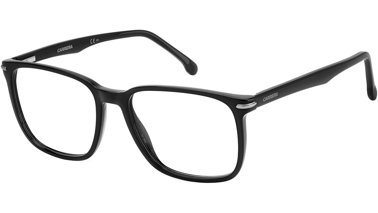
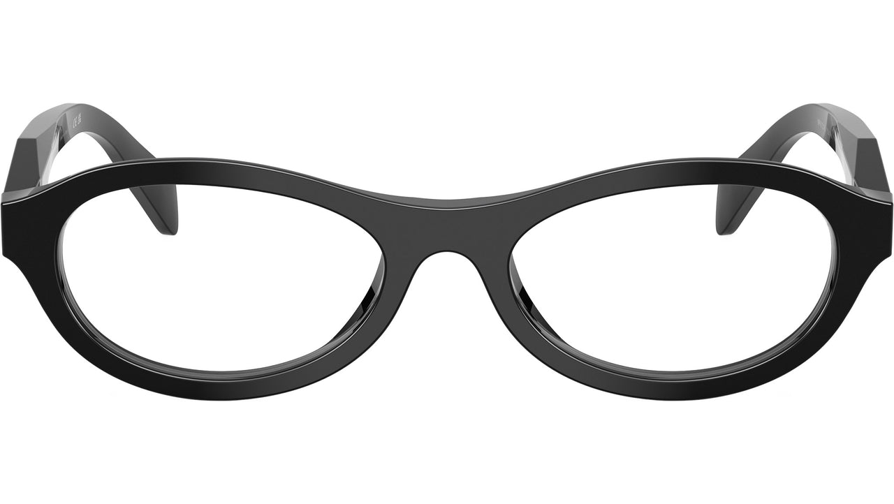
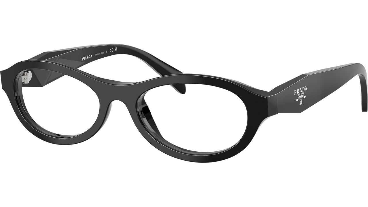
The Carrera 309 807 Black interprets black through a rectangular acetate silhouette, while the 8000 Barto Black brings it into bolder, retro-inspired shapes. Different expressions, but the same principle: black defines.
Havana: warming
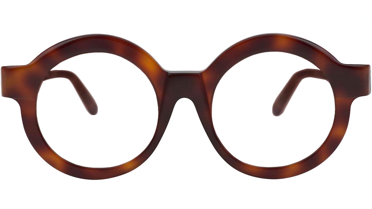
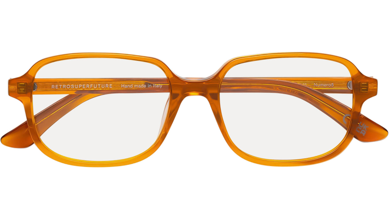
From deep brown to honey tones, Havana introduces warmth and softness. It is a colour rooted in the tradition of acetate, yet constantly reinterpreted.
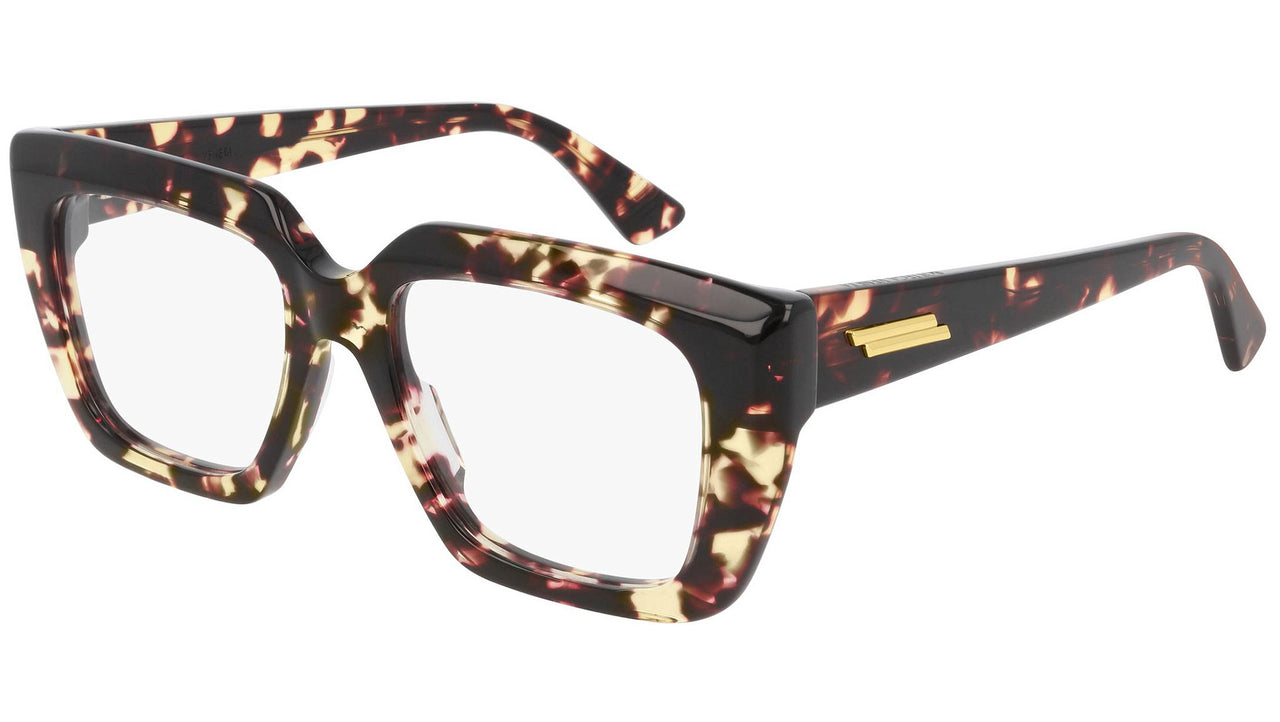
The Brunello Cucinelli BC3004 Black Havana combines black and Havana for a sophisticated contrast, while the Bottega Veneta BV10320 002 Shiny Havana highlights the material and luminous quality of the shade.
Havana is versatile precisely because it can feel classic, sophisticated or contemporary.
Transparent: lightening
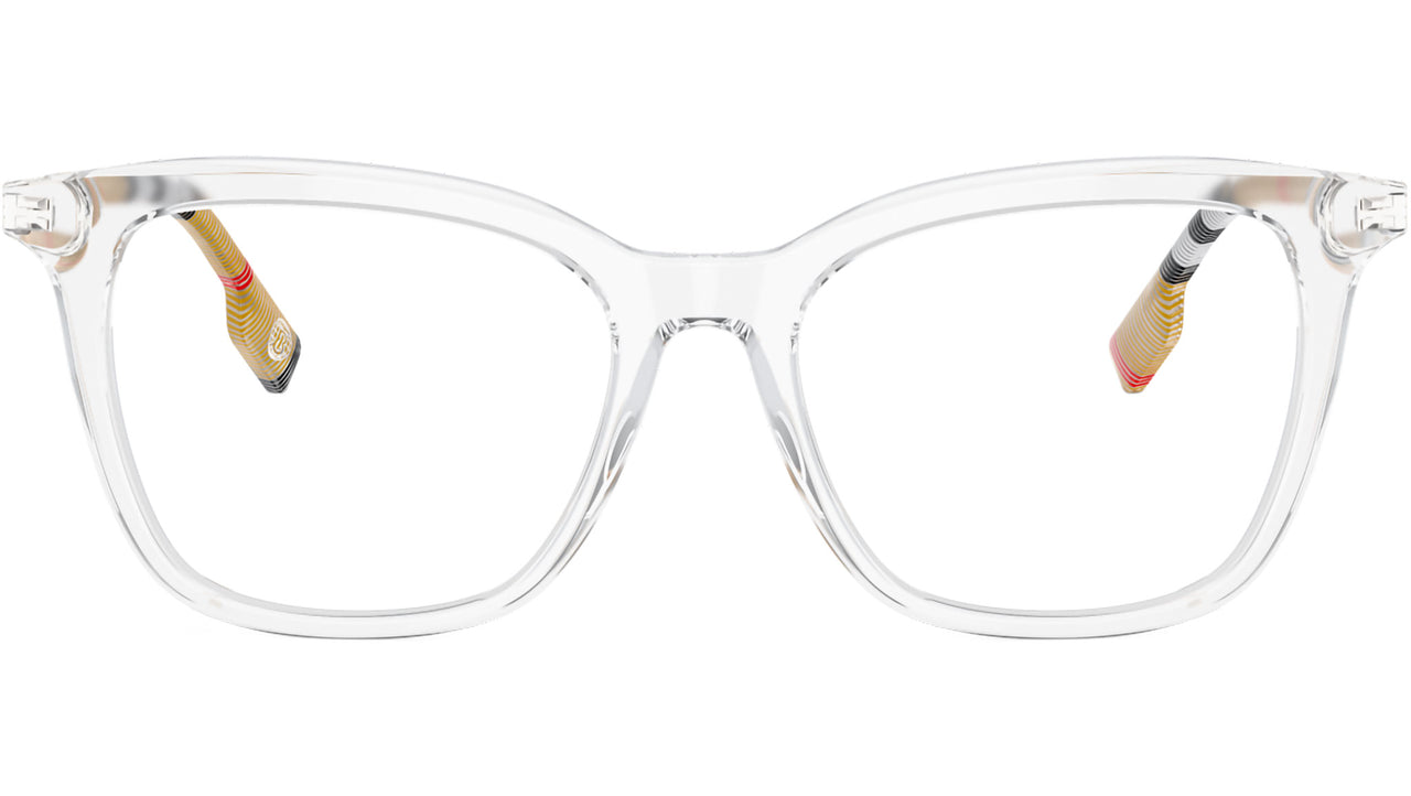
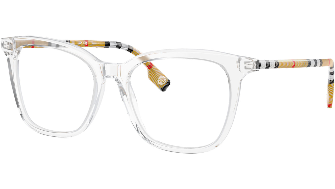
Transparent frames change the relationship between eyewear and face. The shape remains important, but the colour lets light through and reduces the visual weight of the frame.
The Burberry BE2390 Transparent and Dita Mann DTX102 Crystal Clear offer two different interpretations of the same idea: lightening without disappearing.
When colour takes centre stage
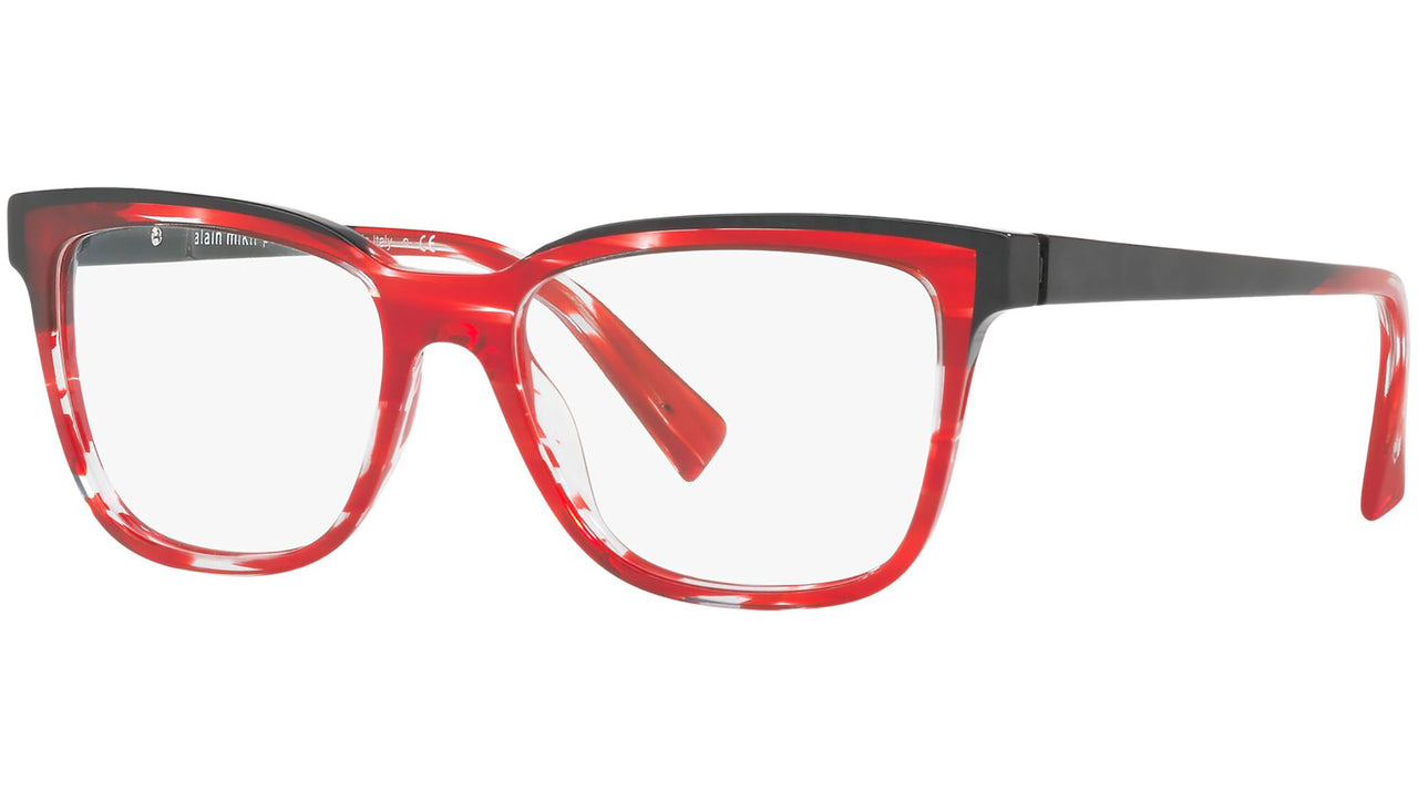
Red, blue, green, purple: stronger shades turn eyewear into a statement.
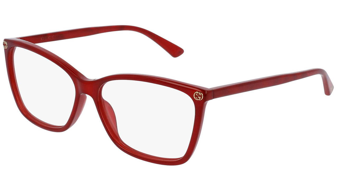
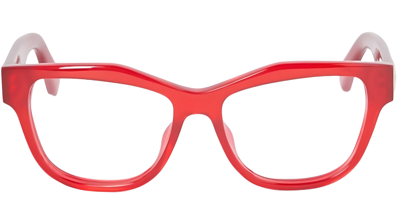
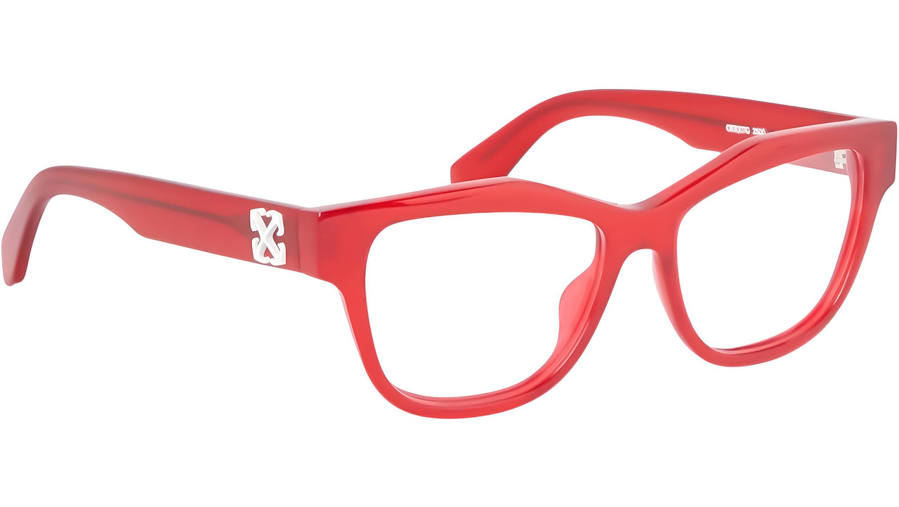
The Alain Mikli 3077 003 Red, for example, places colour at the heart of the frame’s identity. The Gucci GG0025O 004 Red takes a more fashion-led approach, while the Off-White Style 7G Red uses colour to make its silhouette even more distinctive.
Here, colour doesn’t simply complement the shape: it becomes the shape.
A choice between style and instinct
There is no universally right colour. The choice comes from the meeting point between what we like, what suits us and the image we want to communicate.
Sometimes we choose the colour that reflects who we are. Other times, we choose the one that lets us experiment with a different version of ourselves.
That is the fascination of eyewear: we try on a frame, look in the mirror, and often the feeling comes before the explanation.
Colour is a visual language of style, personality and instinct. Because when we choose a pair of glasses, we are not only choosing how to see the world, we are choosing how we want the world to see us.